Revamping Documentation Information Architecture at Statsig
![]()
At Statsig, I owned the end-to-end redesign of our documentation information architecture (IA). The goal was to reduce friction for developers, improve onboarding for new customers, and make content contribution easier for internal teams.
This case study captures my process, from research and stakeholder interviews through iterative prototyping, card sorting, and phased implementation.
TL;DR Summary
Before
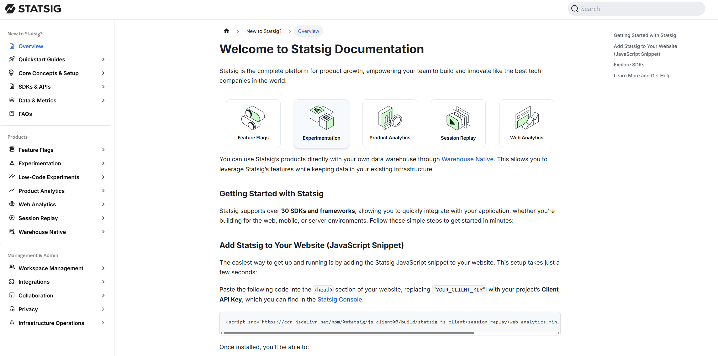
When I joined, Statsig’s docs had no higher-level information hierarchy. Every audience — from non-technical decision makers to data scientists to developers — landed on the same Getting Started page, despite having very different goals. (e.g., “What is a feature flag?” vs. “Implement an A/B test in Python”).
After
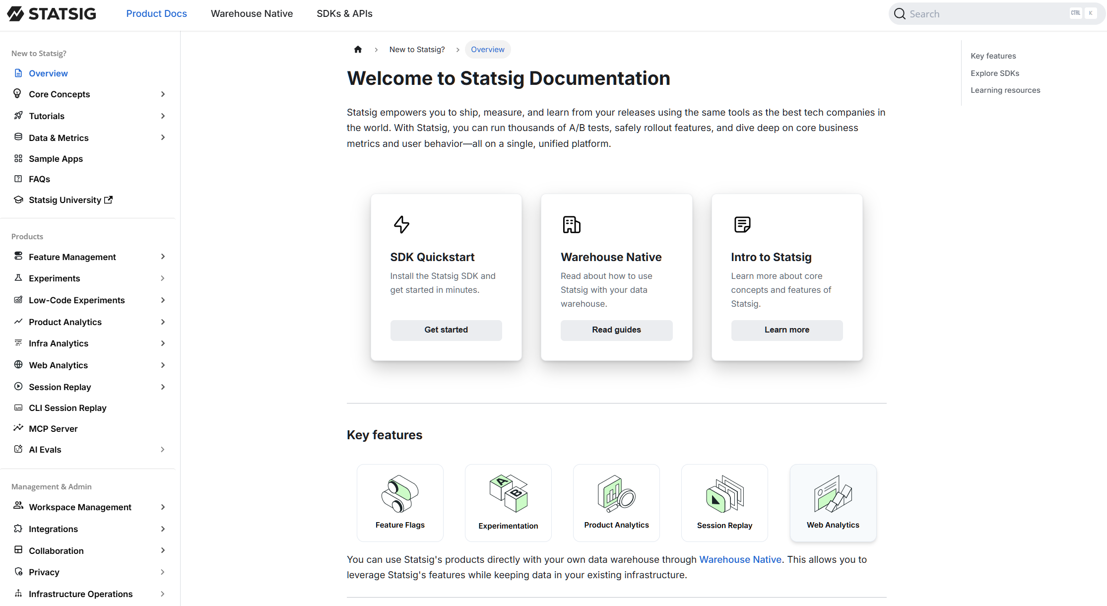
Through a highly collaborative and UX research-driven process, I redesigned the IA with three top-level tabs, separating content by use case and prioritizing a seamless onboarding flow for our critical developer persona. This is the first phase of a long-term venture to migrate our docs to Mintlify.
Context & Challenges
When I joined Statsig, feedback from both customers and internal employees highlighted several key issues:
- Customer pain points: Outdated docs, overwhelming navigation, unclear separation between quickstart vs. in-depth best practices.
- Internal pain points: Contributors disliked writing docs, and no one knew where to place content in the existing structure.
I also knew developer experience was key to technical content marketing — so getting IA right was not just a usability project, but also a growth lever.
Research & Discovery
I started by gathering perspectives across the org:
- Interviews with SDK/APIs PM, Sales PM, and Solutions Engineers to capture common pain points.
- Collected customer support tickets highlighting navigation complaints.
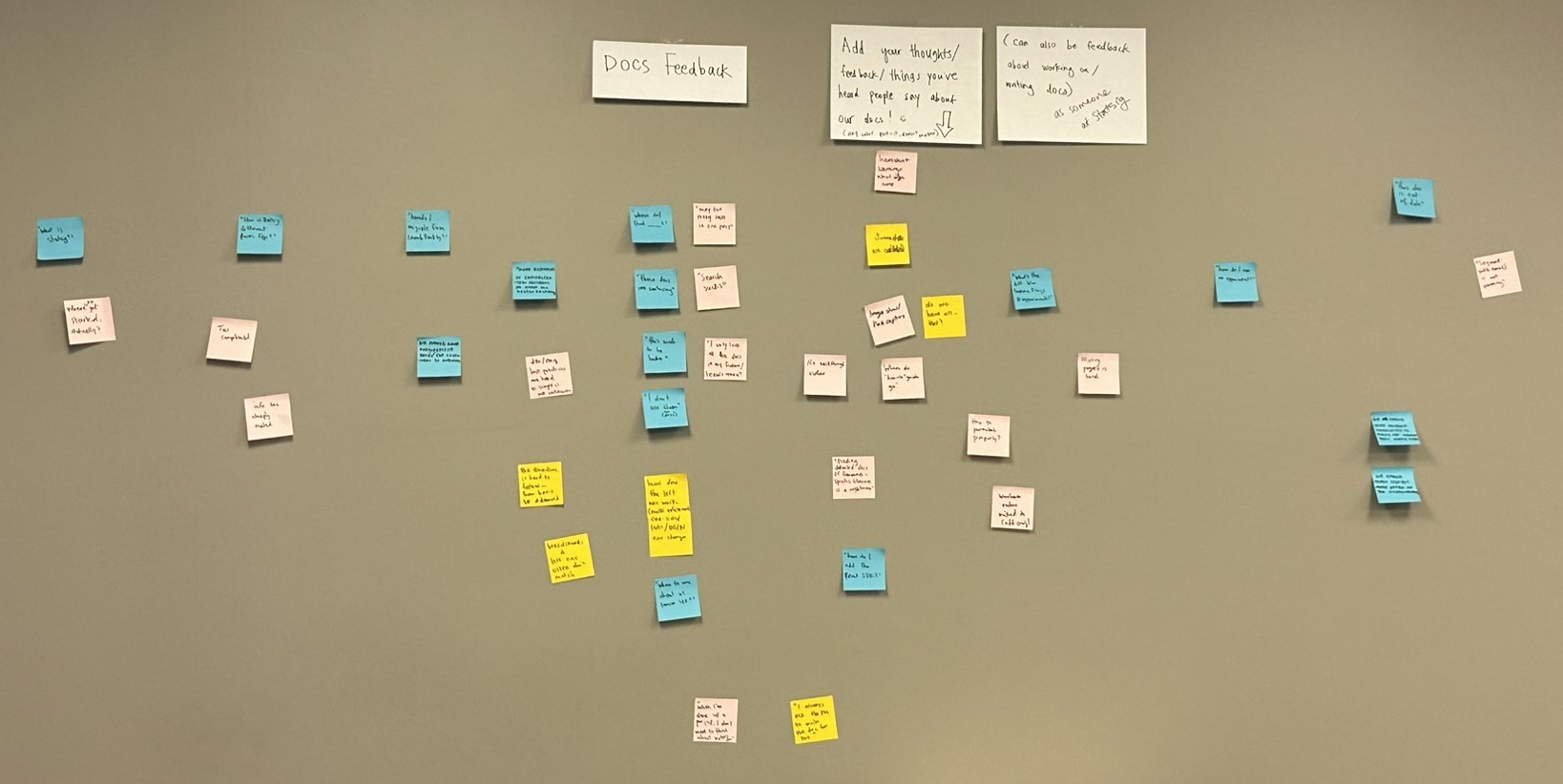
- Launched a feedback wall where teammates could post sticky notes with frustrations and suggestions — this helped surface both external and internal user perspectives.
I also benchmarked against competitor docs and best practices from Write the Docs to understand industry standards.
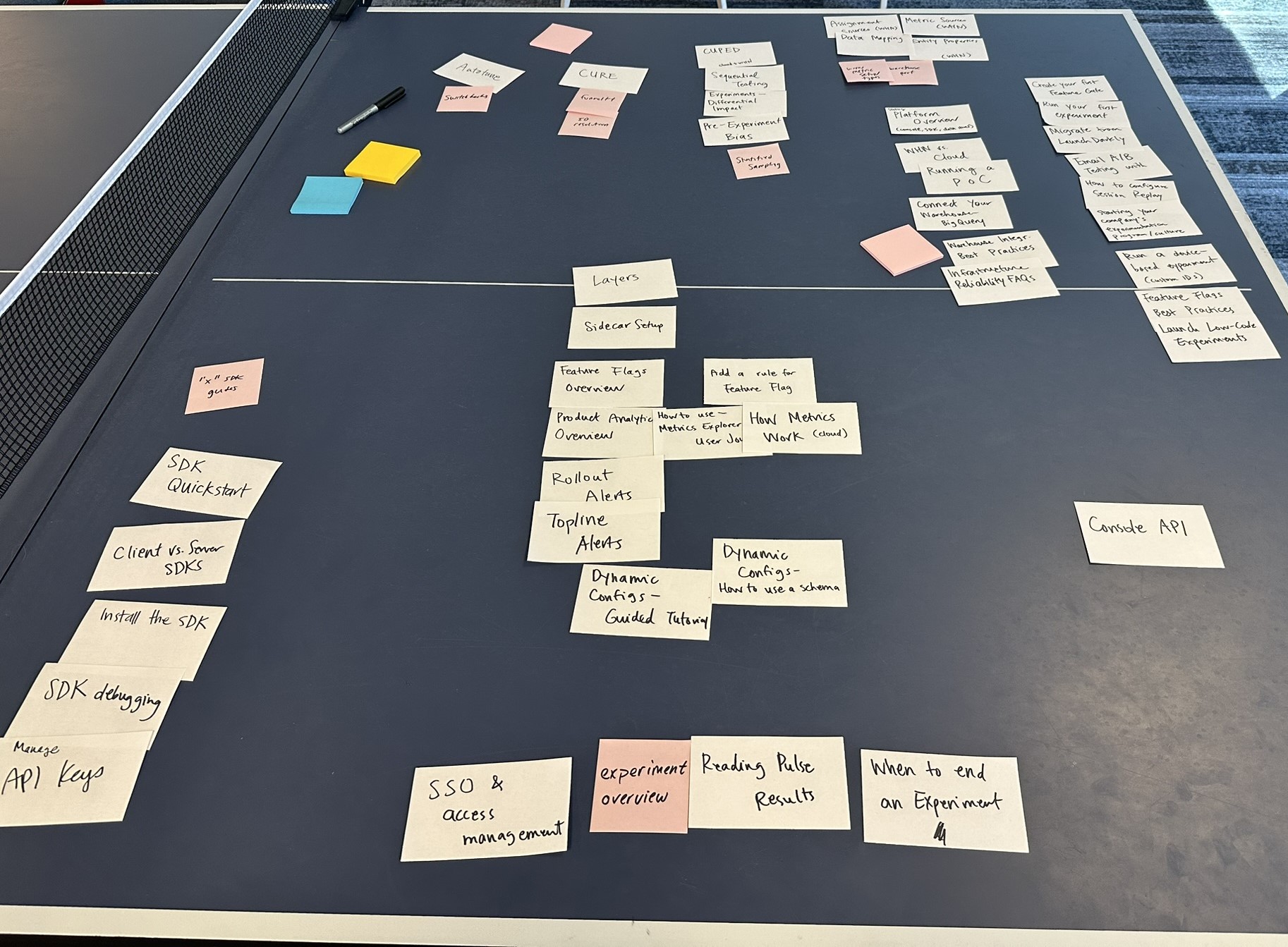
Mapping the Current State
To fully understand the scope of the problem, I:
- Used Python to scrape and generate a sitemap of the existing docs.
- Conducted a manual audit of top navigation pages in a spreadsheet.
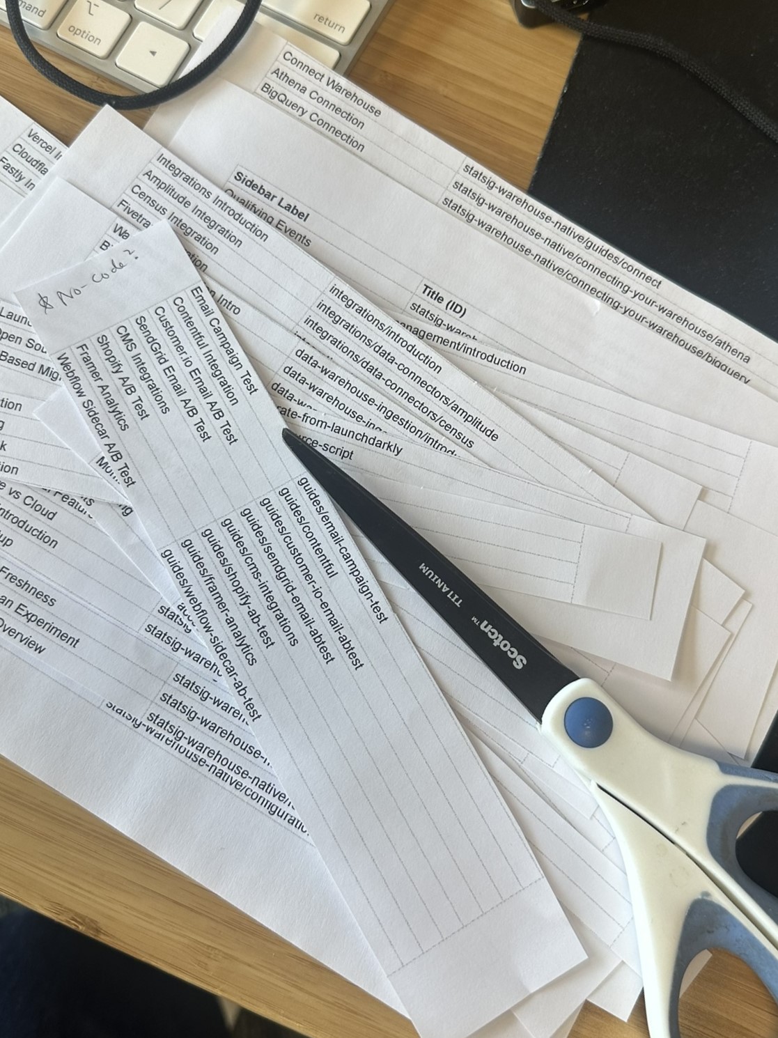
- Printed the sitemap and did a hands-on card sorting exercise, cutting and reorganizing content to explore new groupings.
Collaborative Design
With an initial hypothesis, I facilitated collaborative card sorting with stakeholders to validate and refine new categories.
I proposed new tab categories that matched user goals rather than internal org silos, then created low-fi prototypes in slides and worked with a designer on a hi-fi mockup to socialize the vision.
Phased Implementation
I broke the rollout into phases to minimize disruption while steadily improving the user experience:
-
Phase 1: Introduced new top-level tabs (User Docs, SDKs & APIs, Product Reference, Enterprise Guides). To ease the transition, I added visual cards on the welcome page to funnel users.
→ Metrics showed 12% of users immediately clicked SDKs & APIs, validating the new flow.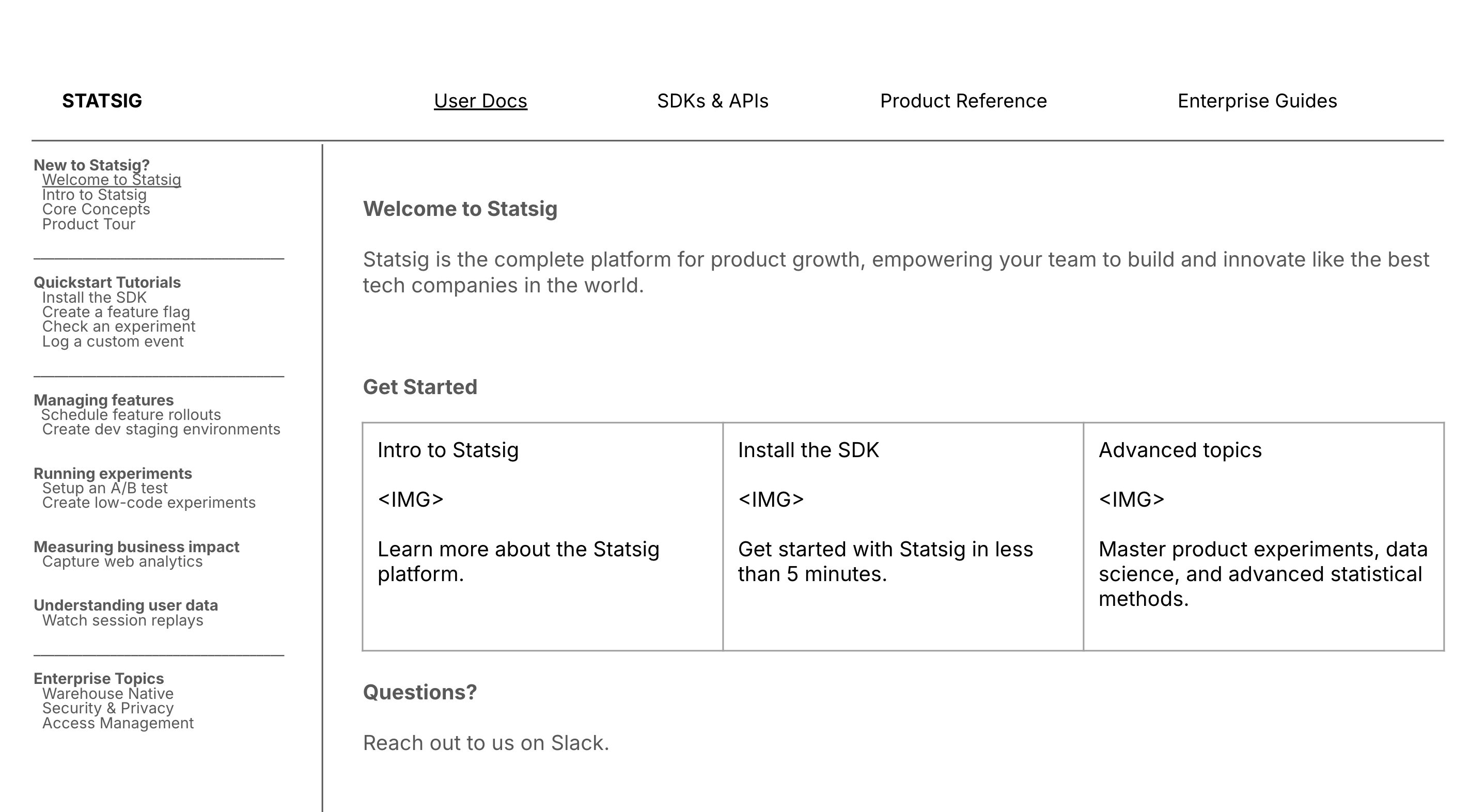
-
Phase 2: Fixed confusing UX bugs with Warehouse Native docs (nested page issues, unclear product versioning). Added info bubbles to reduce user error until full auto-routing could be implemented.
-
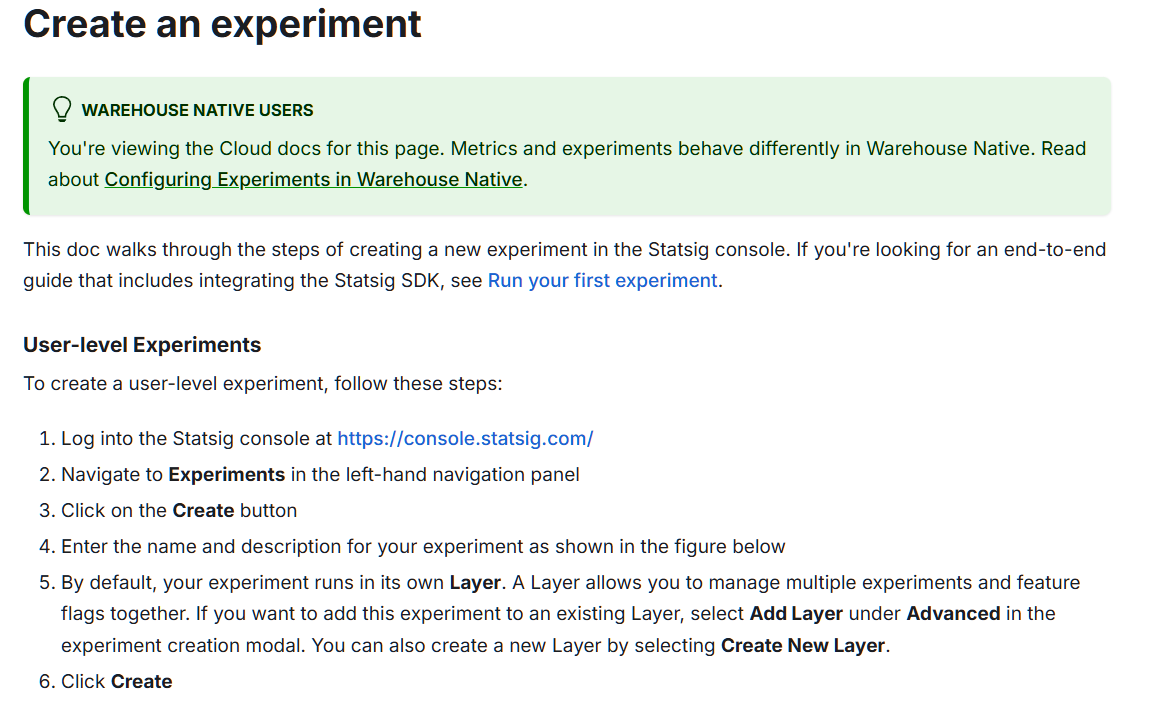
Phase 3: Simplified and unified SDK/API documentation.
-
Phase 4: Polished onboarding docs for general users (What is Statsig, how does it work, etc.).
-
Phase 5: Expanded and clarified Cloud vs. Warehouse Native documentation.
-
Phase 6: Prepared migration to Mintlify for long-term scalability.
Outcomes
- Created a clearer IA aligned with user personas and goals.
- Reduced onboarding friction through dedicated quickstart and welcome flows.
- Improved internal contributor UX by giving docs a more intuitive structure.
- Implemented metrics dashboards to measure success and validate design choices.
This project demonstrated how information architecture, developer empathy, and collaborative design can directly improve product adoption and support efficiency.
Next Steps
The long-term roadmap includes:
- Finalizing the Mintlify migration.
- Ensuring repo/file structure fully matches the IA.
- Continuing to monitor navigation metrics to refine the experience.